
The course, Information Visualization for Journalists, was one of three new six-week, 1.5 credit modules currently being piloted at the school during the 2015-16 academic year.
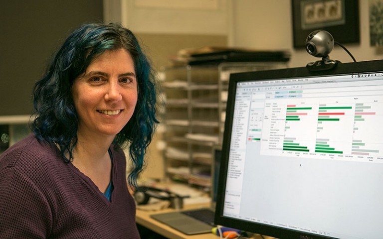
It was taught by a leading researcher on data visualization, UBC Computer Science professor Tamara Munzner.
In this course, students developed fundamental data visualization concepts and skills, including wrangling, interpreting and presenting data in a journalistic context. They worked predominantly using Tableau software that helps create interactive data visualizations using public or manually-created databases.
Munzner said the course was meant to combine theoretical and practical elements of data viz, so students are prepared to apply it to their reporting.
“It’s the intersection of the ideas and the math and the programming and the tools and where they all come together. I’m trying to get people off the ground and to what they’re going to use in a newsroom,” she said.
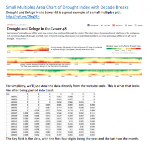

Students’ assignments included recreating NYT data visualizations from scratch.
“Learning how to get comfortable from knowing nothing about a data set to better understanding it was what I was trying to teach and I think [the students] definitely got a handle on that,” said Munzner.
She recently received the Visualization Technical Achievement Award for her 2014 book, Visualization Analysis and Design.
With data visualization being an in-demand skill for employers, it was important to focus on hands-on data wrangling and using tools to create interactive visualizations.
“You want broadcast, you want web skills, you want data viz, there are a bunch of hats you all want to be able to wear,” said Munzner.
Second year MJ student Paolo Pietropaolo dove into the module and has since used the skills he developed to create visualizations for journalistic projects he’s working on.
“What was great about the class for me was that I had never thought of the use of numbers and stats as source of stories.”
“It’s always going to be a new tool and there will always be a learning curve, but this class allowed me to try things in a controlled environment. It has completely reframed how I look at my work.”
Sample the content of the course, including tutorials for creating data visualizations using Tableau, on the course site.

